Hi Guys,
As some of you already know, we are currently in the process of redesigning the LCB and its sister sites.
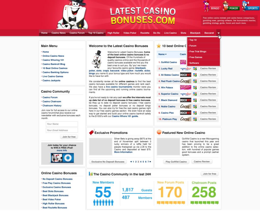
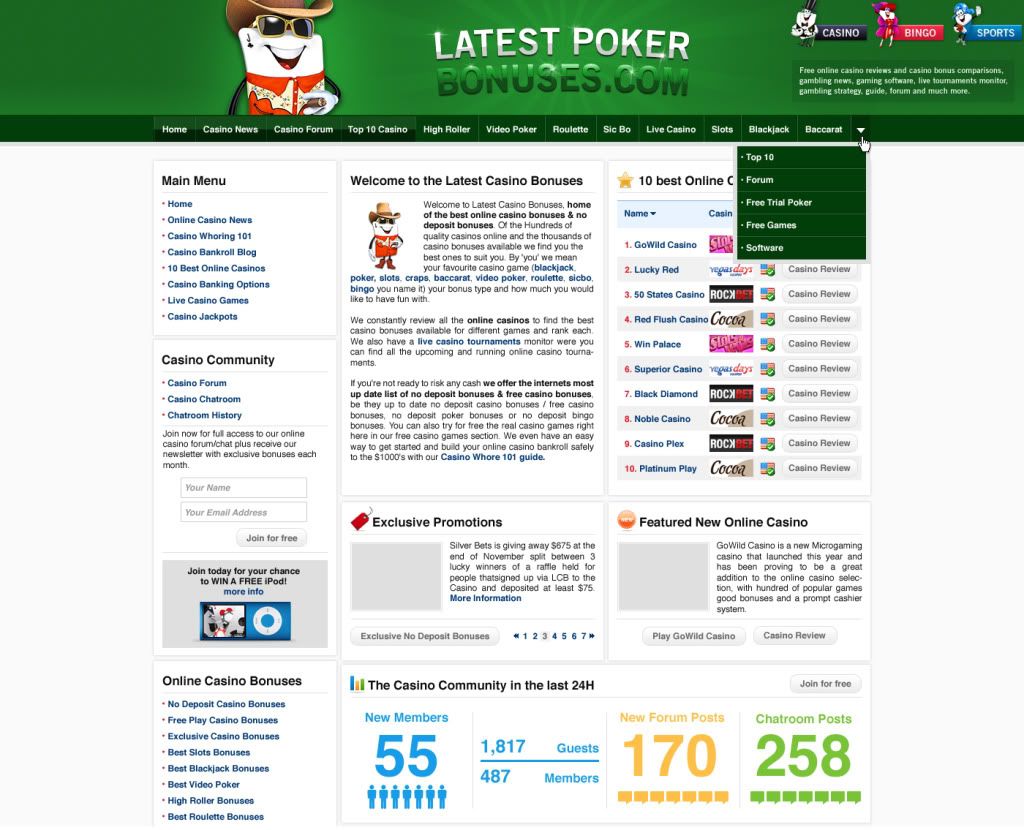
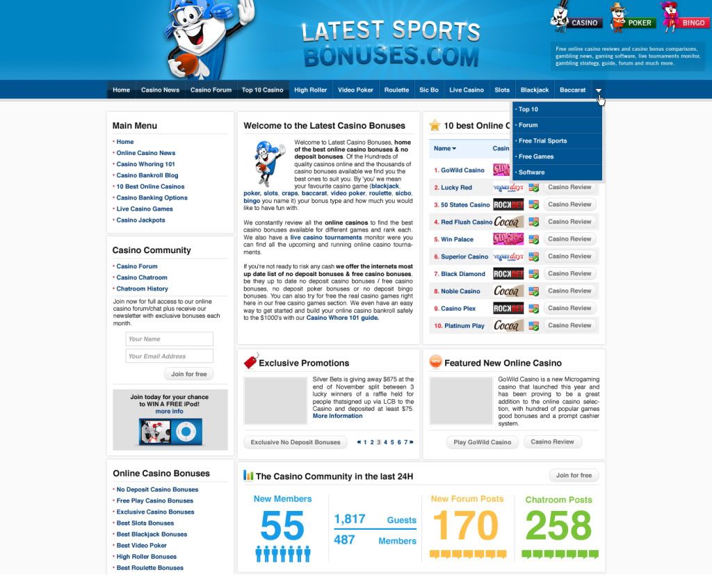
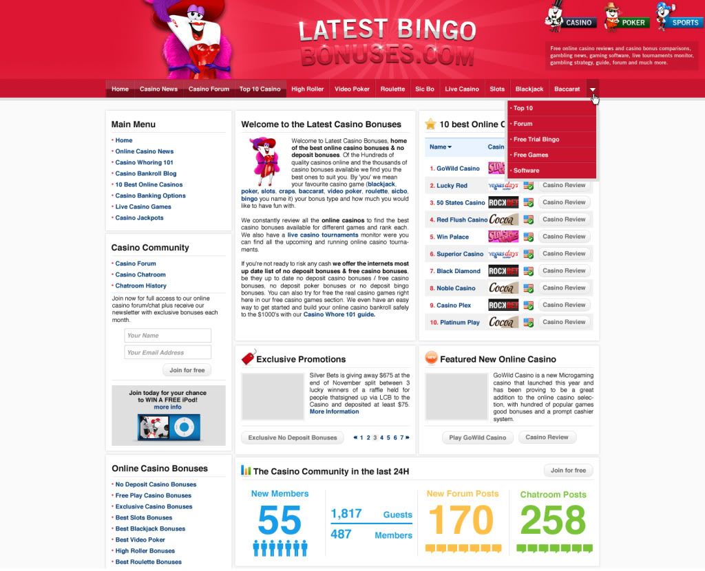
Here are the samples of the new look.
Would you prefer dark blue or red header for LCB?
Would you prefer the current feel of the top tabs or a more simple with the drop down menu like the ones included in the screen shots?
I have created a poll so you can cast your votes, and also any feedback would be much appreciated.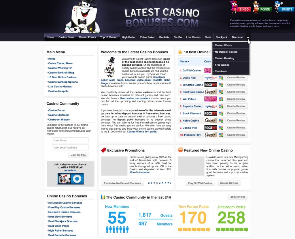
cheers
Zuga
Poll - Do you prefer...
-
Dark blue casino header41.03% (16)
-
Red casino header17.95% (7)
-
Current top tabs28.21% (11)
-
New top tabs with drop down menu12.82% (5)
Total Members Voted: 39
-

- Started by
- zuga
- at Mar 10, 10, 07:46:12 AM
-
 Admin
8359
Admin
8359
Thanks for this post from:
-

- Replied by
- Booo73
- at Mar 10, 10, 10:05:27 AM
-
 Super Hero
1212
Super Hero
1212
-
- Replied by
- blueday
- at Mar 10, 10, 10:42:01 AM
-
 Almighty Member
38014
Almighty Member
38014
-

- Replied by
- dirkemans
- at Mar 10, 10, 10:51:08 AM
-
 Hero Member
916
Hero Member
916
-

- Replied by
- PMM2008
- at Mar 10, 10, 11:06:17 AM
-
Mighty! Member
3103
-

- Replied by
- satansmuff
- at Mar 10, 10, 02:42:55 PM
-
Super Hero
1584
-

- Replied by
- Lipstick
- at Mar 10, 10, 02:52:47 PM
-
Admin
13900
-
- Replied by
- Lipstick
- at Mar 10, 10, 02:55:47 PM
-
Admin
13900
-

- Replied by
- Shelli
- at Mar 10, 10, 10:44:49 PM
-
Super Hero
2183
-

- Replied by
- helwin
- at Mar 11, 10, 03:26:07 AM
-
Super Hero
1993
-

- Replied by
- spazz03
- at Mar 11, 10, 09:24:30 AM
-
Sr. Member
391
-

- Replied by
- wnanhee
- at Mar 11, 10, 11:26:32 PM
-
Superstar Member
5413
-

-
- Replied by
- PMM2008
- at Mar 12, 10, 06:00:38 AM
-
Mighty! Member
3103
-
- Replied by
- Imagin.ation
- at Mar 12, 10, 02:19:13 PM
-
Superstar Member
5026
-

- Replied by
- bradwill
- at Mar 17, 10, 08:32:54 PM
-
Full Member
216
-

- Replied by
- genenco
- at Mar 17, 10, 10:52:04 PM
-
Mighty! Member
3032


 )
)Quick Reply
lcb activities in the last 24 hours
Most viewed forum topics

DeeJay505
 2 months ago
Register a new account at Velvet Spins casino for 120 free no deposit spins on sweet 16 blast with this code: SWEETBLAST 100 dollars max cash out 30 times play through is required Have a great day...
Velvet Spins Casino No Deposit

MelissaN
 22 days ago
Eternal Slots Casino - Exclusive No Deposit Bonus New players only - US OK! Amount: $77 How to claim the bonus: Players need to sign up through our LINK and enter the bonus code. Bonus code: LCB77...
Eternal Slots Casino Exclusive No Deposit Bonus

matijan
18 days ago
There are so many new casinos launching these days and it's only natural to want to test them all and find out if they're any good. What do you say about these five for starters? Vote in the poll to...
April 2024 $500 REAL CASH Contest: Let's Test Casinos!


Share on
Twitter
Facebook
Delicious
Reddit